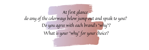
Colors of the Year Contemplation
Have you ever contemplated how the “Color of the Year” is determined? Being in the color business one way or another for nearly half a century, I have frequently wondered about its foundation along the way. So, to satisfy my curiosity (and maybe yours) I’m taking a deep dive into its roots. It’s an art and science thing based on CIPAD (my acronym for Color Inspiration, Psychology, and Anthropology in Design…kind of the opposite of insipid – plus it rhymes – since color is anything but dull or lifeless). Note: This blog is not about color theory which is based on colors organized on a color wheel and grouped into 3 categories: primary colors, secondary colors, and tertiary colors, but rather this is an article about how the major paint companies determine their Colors of the Year.
History of The Color of the Year
“The Color of the Year” is a clever way to influence design choices, market paint products and prompt consumers to live on trend. The Pantone Color Institute™ introduced its Color of the Year concept more than 20 years ago. As you may have noticed, shortly thereafter other paint and color manufacturers e.g., Benjamin Moore®, Sherwin Williams®, Behr®, and others began to release their own Color of the Year palette picks for the hottest hues of any given year (which may or may not resemble Pantone’s). The Benjamin Moore® Color of the Year is a subcategory of their Color Trends palette with 12 hues, Behr® has their Color Trends Palette, and Sherwin Williams® has their Colormix® Forecast for the Color of the Year. We will also explore colours on the other sides of both big ponds: Farrow & Ball® in the UK and Dulux Australia®. These are all major international paint companies that are available in the US.
It all started in 1963 when Pantone introduced the colorful PANTONE MATCHING SYSTEM® to the printing world. Along the way, Pantone has evolved to encompass a Universal Language of Color that enables color-critical decisions for brands and manufacturers. There are several divisions within the Pantone domain. The Pantone Color Institute™ provides customized color standards, brand identity and product color consulting as well as trend forecasting that includes Pantone Color of the Year, Fashion Runway Color Trend Reports, color psychology and more. For our home furnishings discussion, it’s the PANTONE LIFESTYLE division where color and design cross paths for lifestyle-oriented industries – apparel, home, and accessories – inspiring daily life with purposeful color and patterns. If you want to know more About Pantone click here.
Keep in mind that the Pantone Color of the Year is a broad color stroke that is relevant to multiple industries. Whereas Benjamin Moore®, Sherwin Williams®, Behr®, Farrow & Ball®, and Dulux Australia® are home décor paint palettes. So, with that in mind, let’s evaluate the various 2021 Colors of the Year from the perspectives of inspiration, color psychology, and cultural anthropology. But first, let’s define what those terms mean in general and how they relate to color at home.
Color of the Year Philosophy
Inspiration is the creative revelation evoking excitement in your mind or emotions to a high level of feeling or activity. Sometimes, inspiration may also be felt in the form of Divine guidance directly sensed by a human mind or soul. In other words, we are emotionally influenced and sparked into action by an idea (or color) that produces deeper meaning to a project or purpose.
Color Inspiration
When selecting the Color of the Year Pantone explores the globe looking for color influences. They are inspired by pop culture, film, popular travel destinations, socio-economic conditions, organic elements, art, fashion and much more. “The Color of the Year” greatly influences what products are made as well as our purchasing decisions across a variety of industries from fashion, industrial design, product packaging, graphic design, and home goods. All of the home paint color brands follow that same journey path searching the world for color inspiration that is meant to encourage you to Live Well Where You Dwell©.
Psychology is the science of mental processes and behavior concerning the subtle strategic action or reason used to manipulate or influence another person.
Color Psychology
Hues i.e., colors affect human behavior. Color influences our perceptions that may not be obvious, resulting in subtle consequences making us wonder why we are more or less comfortable with certain colors or in particular environments. A color that evokes one reaction in one person may evoke the opposite reaction in another due to culture, prior association, or even just personal preference. There is even psychology in creating the color names.
In any given year most of the paint companies title their palettes to “inspire” you. No matter how it’s labeled the consensus for 2021 is that there is a need for optimism, balance, and natural harmony at home for your personal well-being that can be brought forth to the world. Let’s call the Benjamin Moore® palette “Settle In”; Sherwin Williams® describes theirs as “Rhythm of Color”, and Behr® titled theirs “Elevated Comfort”; Grace Your Dwelling Place® characterizes it as “Live Well Where You Dwell©”. (The paint companies across the ponds didn’t title their 2021 trend palettes.) The inspiration for the transformative spirit of color and what the world needs now is heavily dependent (in my opinion) on the psychological aspect. Thus, this section is more comprehensive than the other theory sections since psychology is a very strategic part of the color selection process that also encompasses inspiration and anthropology.
In general, colors may have the following connotations:
- Red: Passion, Love, Anger
- Orange: Energy, Happiness, Vitality
- Yellow: Happiness, Hope, Deceit
- Green: New Beginnings, Abundance, Nature
- Blue: Calm, Responsible, Sadness
- Purple: Creativity, Royalty, Wealth
- Black: Mystery, Elegance, Evil
- Gray: Moody, Conservative, Formality
- White: Purity, Cleanliness, Virtue
- Brown: Nature, Wholesomeness, Dependability
- Tan or Beige: Conservative, Piety, Dull
- Cream or Ivory: Calm, Elegant, Purity
Regarding the prominent color palettes for 2021:
Blues and Greens:
Cool colors include green, blue, and purple which are often more subdued and understated than warm colors. They are the colors of night, of water, of nature, and are usually calming, relaxing, and somewhat reserved. Think of how the sea and sky provide subtle focus and calm.
Warm Neutrals:
Neutral colors often serve as the backdrop in design. They’re commonly combined with brighter accent colors. But they can also be used on their own and can create a very sophisticated ambiance. The meanings and impressions of neutral colors are much more affected by the colors surrounding them. The warm neutrals of 2021 convey a warm, cozy space that feels natural and earthy providing casual comfort.
Vibrant and Playful Jewel Tones:
It makes sense that in unsettling times we want to make our homes feel as warm and welcoming as possible, and rich red/purple tones do just that by adding coziness to a room. Touches of lavish bold hues can easily be mixed into a neutral room for a touch of luxurious comfort imparting a sense of optimism. A vibrant yellow is believed to heighten awareness and enhance intuition.
“Our most basic [color] associations started with our instinctive need to survive…”
Anthropology is the scientific study of human societies and cultures in the context of their environment and development. There is also a part of Christian theology concerning the genesis, nature, and future of humans, especially as contrasted with the nature of God.
Color Anthropology
Color is hardwired into the human experience. From the very beginning, color informed our daily lives. In his book Color Inspirations Darius A. Monsef IV says, “Our most basic associations started with our instinctive need to survive[…]blue water to quench our thirst,[…]red fire for warmth,[…]green plants for food.” Our relationship with color has evolved to express emotion, class, and spirituality…. Each hue has its own deep history of connotations. Color may have different meanings and responses across cultures and environments. Cultural differences can affect the perception of a hue’s meaning – while a hue that’s happy and uplifting in one country might be solemn and depressing in another.
Color of the Year Analysis
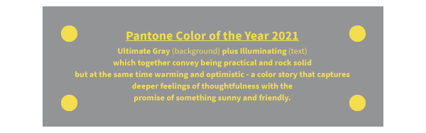
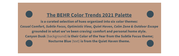
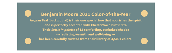
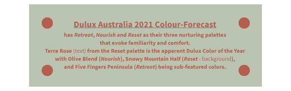
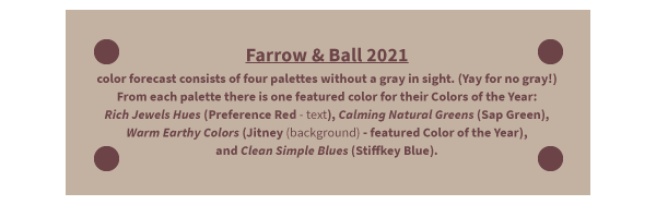
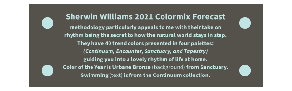
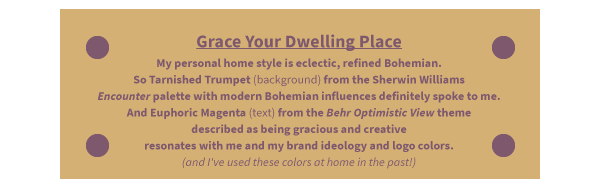
Summarized below are each brand’s “Color(s) of the Year” with their featured “color of the year” shown as the background fill color and one of their coordinating colors (of my choosing) cast as the text color. Descriptions aspire to each brand’s inspirational, psychological, and anthropological reasonings.
Color of the Year Conclusion
Have you noticed how all the colors across all brands easily mix and match, coordinate, and interchange with each other? I wonder…do these companies consult with each other?
All of the brands’ 2021 color palettes include neutrals mixed with some lavish bolds to create “energizing yet comforting” focal points in a home. And then there are the counterpoints of the calming cool lighter colors that balance the palettes with tranquility. Overall, the philosophy behind the 2021 color palettes embraces my mantra totally: Harmony and Balance at home to Live Well Where You Dwell©
I quite like many of the colors in all the brands’ palettes and might repaint a bathroom (including the ceiling) and possibly add some accent décor pieces here and there elsewhere. Are you inspired to refresh your home?
So, in the final analysis let’s summarize CIPAD as: “Color inspires us to behave as our own particular person based on our experiences and environment.” Please don’t be a chaser of trends – be your own person and incorporate what works for you. I’d be happy to help you!